
Choosing the Perfect Color Palette for Your Home – WordPress
Choosing the perfect color palette for your home can be a daunting task, especially with the countless options available. Color palette is the foundation of any successful interior design, and it can greatly impact the mood, ambiance, and overall feel of your space. In this article, we will explore the importance of color palettes, provide tips for choosing the perfect one, and offer inspiration for creating a beautiful and harmonious interior design.
Understanding Color Theory
Before we dive into the world of color palettes, it’s essential to understand the basics of color theory. Color theory is the study of how colors interact with each other and the emotions they evoke. It’s based on the color wheel, which is a circular representation of colors, with primary colors (red, yellow, and blue) at the center. Secondary colors (orange, green, and violet) are created by mixing two primary colors, while tertiary colors are made by mixing primary and secondary colors.
When it comes to color palettes, there are several principles to keep in mind:
- Monochromatic: using different shades of the same color
- Complementary: pairing colors that are opposite each other on the color wheel
- Analogous: using colors that are next to each other on the color wheel
- Triadic: using colors that are equally spaced from each other on the color wheel
Tips for Choosing the Perfect Color Palette

Now that we’ve covered the basics of color theory, let’s move on to some practical tips for choosing the perfect color palette for your home:
- Consider the natural light: take note of the amount and type of natural light your space receives, as this will impact the colors you choose
- Think about the mood you want to create: different colors can evoke different emotions, so consider the atmosphere you want to create in your space
- Look to nature for inspiration: nature is full of beautiful color combinations, from the soft hues of a sunset to the bold tones of a tropical flower
- Don’t forget about neutrals: neutral colors like beige, gray, and white can provide a background for your color palette and help to balance out bold colors
- Test the colors: once you’ve narrowed down your options, test the colors with a paint sample or by using an online visualizer tool
Inspiration for Creating a Beautiful Color Palette

Here are a few examples of beautiful color palettes to inspire you:
- Soft and serene: pair soft blues and whites with warm beige and natural wood tones for a calming and peaceful atmosphere
- Bold and bright: combine bold colors like coral, yellow, and orange with neutral whites and grays for a fun and energetic space
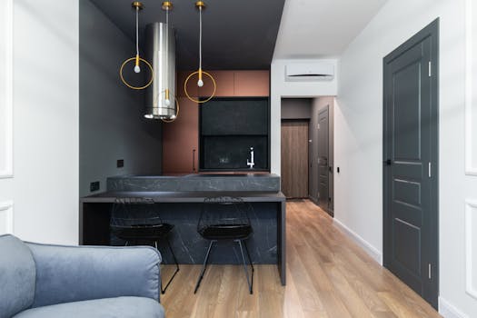
- Moody and dramatic: use deep, rich colors like emerald green, navy blue, and charcoal gray to create a dramatic and sophisticated atmosphere
Remember, the key to creating a beautiful color palette is to have fun and experiment with different combinations. Don’t be afraid to try new things and make mistakes – it’s all part of the process!