
Choosing the Perfect Color Palette for Your Home: A Comprehensive Guide
Introduction to Choosing the Perfect Color Palette for Your Home
Choosing the perfect color palette for your home can be a daunting task, especially with the numerous options available. Choosing the perfect color palette for your home is a crucial aspect of interior design, as it can greatly impact the ambiance and overall aesthetic of your space. In this article, we will guide you through the process of selecting the perfect color palette for your home, from understanding color theory to selecting the right colors for your space.
Understanding Color Theory

Before we dive into the nitty-gritty of choosing a color palette, it’s essential to understand the basics of color theory. Color theory is the study of how colors interact with each other and the impact they have on human emotion and perception. The color wheel is a fundamental tool in color theory, as it illustrates how colors are related to each other. The color wheel is divided into primary colors (red, blue, and yellow), secondary colors (orange, green, and violet), and tertiary colors (colors created by mixing primary and secondary colors).
Color Harmony
Color harmony refers to the way colors work together to create a visually appealing effect. There are several principles of color harmony, including monochromatic, complementary, analogous, and triadic. Monochromatic color schemes use different shades of the same color, while complementary color schemes use colors that are opposite each other on the color wheel. Analogous color schemes use colors that are next to each other on the color wheel, and triadic color schemes use colors that are equally spaced from each other on the color wheel.
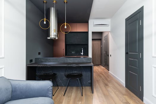
Selecting the Right Colors for Your Space

When selecting colors for your space, it’s essential to consider the natural lighting, furniture, and decor. Natural lighting can greatly impact the way colors appear in your space, so it’s crucial to test colors at different times of the day. Furniture and decor can also influence the color palette, as they can add warmth, texture, and depth to your space.
Considering the 60-30-10 Rule
The 60-30-10 rule is a widely used principle in interior design, which suggests that 60% of your space should be dominated by a neutral color, 30% by a secondary color, and 10% by an accent color. This rule can help create a balanced and harmonious color scheme in your space.
Popular Color Palettes for Homes

There are numerous color palettes that are popular for homes, depending on the style and aesthetic you’re aiming for. Some popular color palettes include:
- Monochromatic neutrals: Shades of beige, gray, and taupe can create a calming and serene atmosphere in your home.
- Earth tones: Colors such as green, brown, and tan can bring a sense of warmth and coziness to your space.
- Bold and brights: Colors such as red, orange, and yellow can add energy and vibrancy to your home.
- Soft pastels: Soft pink, baby blue, and mint green can create a soft and soothing atmosphere in your space.
Conclusion

Choosing the perfect color palette for your home can be a fun and creative process, but it can also be overwhelming. By understanding color theory, considering the natural lighting and furniture in your space, and selecting colors that reflect your personal style, you can create a beautiful and harmonious color scheme in your home. Remember to have fun and experiment with different colors and color combinations until you find the perfect palette for your space.