
Understanding Color Psychology
Colors significantly influence mood, energy levels, and even perceptions. Before diving into swatches and paint charts, it’s essential to understand the psychology behind various colors.
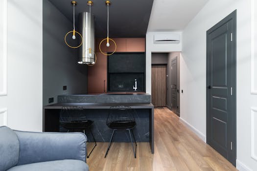
Warm colors, such as reds, yellows, and oranges, can create feelings of warmth and coziness, making them ideal for social areas like kitchens and dining rooms. Cool colors, like blues and greens, are often soothing and visually calming, perfect for bedrooms and bathrooms. Neutrals, on the other hand, provide a versatile foundation that can pair beautifully with bold accents.
Identifying Your Style

Your personal style will greatly influence your palette choices. Are you drawn to modern, minimalist designs, or do you prefer a more rustic and eclectic feel? Collect inspiration from design magazines and websites, and begin noting the colors and tones that resonate with you.
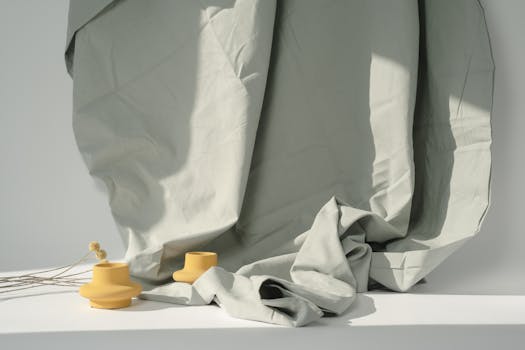
Additionally, consider how the colors will blend with your existing decor and furnishings. Create a mood board by gathering fabric swatches, images, and even paint samples to establish a clear vision of your ideal space.
Creating a Cohesive Palette

Once you have a clear understanding of color psychology and your style preferences, it’s time to formulate your color scheme. A good rule of thumb is the 60-30-10 guideline: 60% of the dominant color, 30% of a secondary color, and 10% of an accent color.
This method can ensure a balanced look throughout your home. For example, if you choose a soft gray as your dominant color for walls (60%), you could use a warm beige for furniture (30%), and a vibrant coral for accent pillows or artwork (10%). Additionally, consider using analogous colors, whether they are next to each other on the color wheel, or complementary colors for visual interest.
Testing Paint Samples
Before committing to a full makeover, always test paint colors in your home. Lighting conditions can drastically alter how colors appear, so it’s crucial to paint patches on all walls to see how they react at different times of the day.
Live with the colors for a couple of days to get a real feel for how they affect the ambiance of your space. And don’t be afraid to experiment ! If you ultimately lean toward a watermelon pink or a sage green in limited amounts, these atypical shades can make stunning accents and personalized touches to your decor.
Finalizing Your Choices

Once you have narrowed down your favorite paints and accent colors, it’s important to create a plan for how they will flow from one room to the next, especially in wider spaces and hallways.
Always consider your furnishings and how they will juxtapose with the new wall paints. Bold furniture can often override your mural intentions, so it’s wise to coordinate professionally, either with a designer or coats of paint that compliment varied textures and shades present in upholstery.