Choosing the Perfect Color Palette for Your Home
Introduction to Color Palettes
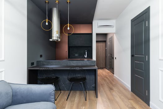
Choosing the perfect color palette for your home can be a daunting task, but it’s an essential part of creating a beautiful and harmonious space. Choosing the perfect color palette for your home is not just about picking a few colors you like, it’s about creating a cohesive look that reflects your personal style and complements the architecture of your home. In this article, we’ll explore the importance of color, how to select a palette, and provide tips for creating a stunning and functional space.
Understanding Color Theory

Before we dive into choosing a color palette, it’s essential to understand the basics of color theory. Color theory is the study of how colors interact with each other and the emotions they evoke. There are several key principles to keep in mind when selecting a color palette, including:
- Monochromatic: Using different shades of the same color to create a cohesive look.
- Complementary: Pairing colors that are opposite each other on the color wheel to create contrast and visual interest.
- Analogous: Using colors that are next to each other on the color wheel to create a harmonious and soothing palette.
Understanding these principles will help you create a color palette that’s both beautiful and functional.
How to Select a Color Palette

Now that we’ve covered the basics of color theory, let’s talk about how to select a color palette for your home. Here are a few steps to follow:
- Start with a neutral base: Choose a neutral color for your walls, such as white, gray, or beige, to provide a clean canvas for your furniture and decor.
- Consider the natural light: Think about the amount of natural light your room receives and how it will affect the colors you choose. Lighter colors can make a room feel brighter, while darker colors can make it feel cozier.
- Think about the mood you want to create: Different colors can evoke different emotions and moods. For example, blue can create a calming and serene atmosphere, while red can create a bold and energetic one.
- Look to nature for inspiration: Nature is full of stunning color palettes, from the soft hues of a sunset to the bold colors of a tropical flower. Take a cue from nature and use its colors to inspire your palette.
By following these steps, you can create a color palette that’s both beautiful and functional.
Tips for Creating a Harmonious and Beautiful Space

Now that we’ve covered the basics of color theory and how to select a color palette, let’s talk about some tips for creating a harmonious and beautiful space. Here are a few to keep in mind:
- Use a limited palette: While it can be tempting to use a lot of different colors, it’s best to stick to a limited palette to avoid visual overload.
- Consider the 60-30-10 rule: This rule suggests that 60% of the room should be a dominant color, 30% a secondary color, and 10% an accent color. This will help create balance and harmony in the space.
- Don’t forget about textures and patterns: Textures and patterns can add depth and visual interest to a room, even if you’re using a limited color palette. Mix different textures and patterns to create a rich and engaging space.
By following these tips, you can create a space that’s both beautiful and functional.