
Choosing the Perfect Color Palette for Your Home
Choosing the perfect color palette for your home can be a daunting task, especially with the numerous options available. Choosing the perfect color palette for your home is a crucial step in creating a cohesive and harmonious interior design. A well-chosen color palette can greatly impact the ambiance and aesthetic of your home, making it essential to select colors that reflect your personality and style.
Understanding Color Theory
Before selecting a color palette, it’s essential to understand the basics of color theory. Color theory is the study of how colors interact with each other and the emotions they evoke. The color wheel is a fundamental tool in color theory, consisting of primary colors (red, yellow, and blue), secondary colors (orange, green, and violet), and tertiary colors (colors created by mixing primary and secondary colors). Understanding how colors work together will help you create a harmonious and aesthetically pleasing color palette.
Factors to Consider When Choosing a Color Palette

When choosing a color palette, there are several factors to consider, including:
- Natural Light: The amount of natural light your home receives can greatly impact the colors you choose. Lighter colors can make a room appear brighter, while darker colors can make a room appear cozier.
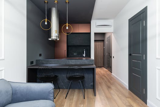
- Furniture and Decor: Consider the colors of your furniture and decor when selecting a color palette. You want to choose colors that complement your existing pieces, rather than clashing with them.
- Personal Preference: Ultimately, the color palette you choose should reflect your personal style and preferences. Consider your favorite colors and how they can be incorporated into your home’s design.
- Room Purpose: Different rooms serve different purposes, and the color palette should reflect this. For example, a bedroom should have a calming and relaxing color palette, while a home office should have a more energizing and stimulating palette.
Popular Color Palettes for the Home

Here are some popular color palettes for the home, featuring a range of styles and combinations:
- Monochromatic: A monochromatic color palette features different shades of the same color. This palette is great for creating a cohesive and harmonious look.
- Complementary: A complementary color palette features colors that are opposite each other on the color wheel. This palette is great for creating a bold and striking look.
- Analogous: An analogous color palette features colors that are next to each other on the color wheel. This palette is great for creating a soft and soothing look.
- Neutral: A neutral color palette features a range of neutral colors, such as beige, gray, and white. This palette is great for creating a calm and serene atmosphere.
Implementing Your Color Palette in WordPress

Once you’ve selected your color palette, it’s time to implement it in your WordPress website. You can do this by:
- Customizing Your Theme: Most WordPress themes allow you to customize the colors and typography. Use this feature to apply your color palette to your website.
- Using a Page Builder: Page builders like Elementor and Beaver Builder allow you to create custom layouts and apply your color palette to individual elements.
- Adding Custom CSS: If you have coding knowledge, you can add custom CSS to your website to apply your color palette.